Friday, 25 October 2013

Music video analysis - Assessment week

'Analyse the following video referencing Goodwin and Vernallis. Particularly focus on gender representation and star image.'


 Goodwin stated that a music video is a way for artists to showcase their new identity and development over time. This relates to an artists star image. This is constructed through close up shots of the artist themselves and through them lip syncing in the video. Vernallis commented that the lip syncing is crucial because the purpose of the video is to sell the song, and more importantly advertise the artist.

This screenshot is a clever way of emphasising the lip sync as what else would you show other than the artists lips whilst they are singing the song.


This example of a close up exemplifies Goodwin's theory that music videos act as a platform for artists to reinforce their new image.


This video immediately echoes Vernallis' theory of editing to the beat as is shown in the opening. Here is a clip of the opening of the video that I am referring to:


Moreover, Vernallis commented that the artist in a video is constantly on camera, whilst extras are placed into the background so the focus is on the star. This can bee seen through the way the staging is set up in the performance part of the video.

'
Another aspect of this screenshot to take note of is the fact that Rihanna is in considerably less clothing than the men in the band. This relates back to gender representation as the female in the video is in minimal clothing and acts out some very provocative dance routines. This confirms Mulvey's theory of objectification of women, which can also be seen at the start of the video where she is covered in body paint with not much else on.


This costume is a form of intertextuality as it is originally from Red Hot Chili Pepper's music video for Give It Away:

Moreover, another form of intertextuality in the video is through the guitar performance and costume by Slash, the songwriter and former lead guitarist of hard rock band Guns N' Roses.
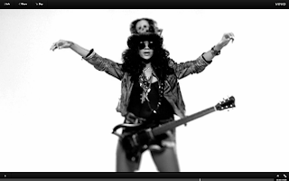
This screenshot shows Rihanna in the video dressed up to resemble Slash. Below is the original look worn by Slash himself. Moreover, the guitar is part of the iconography which was another of Goodwin's theories, as it represents the idea of a Rock star. Moreover, it could be argued that Rihanna's tendency to wear little clothing is part of her iconography as an artist.


This shot is an example of Goodwin's theory of 'a relationship between visuals either illustrating, amplifying, or contradicting the lyrics' as she is seen holding the chain whilst singing the lyrics 'Rocking these diamonds, i'm rocking this chain'.

This extreme close up creates an intimate shot for the audience as it is if Rihanna is directly addressing them.

This is a vivid shot that clearly shows voyeurism as she is sexualised through little clothing. Here, she is also objectified but it could be suggested she is objectifying herself as she the one acting in such a manor. This is an important shot when looking at gender representation as it is almost always women with skimpy clothing.
This screenshot is important as it highlights how much Rihanna has changed her star image. Here she is showing tattoos, cut and died hair, and heavy black makeup. Although this fits with the theme of the song 'rock star' this image is continued throughout most of her new material.


In contrast, this shot shows Rihanna in one of her early music videos 'Unfaithful'. Here, she looks very pure, with elegant make up, jewelry and hair. This emphasizes how her star image has drastically changed throughout her career.
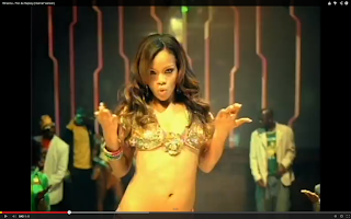
What's more, this shot from another early single 'Pon De Replay' draws attention to the fact that Rihanna has always worn little clothing in her music videos, which proves the comment that it is part of her iconography as a female artist in the industry.

Overall, this video demonstrated aspects of Goodwin and Vernallis' theories whilst confirming that the representation and star image of an artist are crucial aspects of a music video. 

Thursday, 24 October 2013

Digipak conventions

Front cover:

  • Usually has the name of the artist and the title of the album
  • The artist's name is often in a larger font as the album is effectively selling the artist
  • Often the artist's face in close up but if they are well established they tend to not have their face
  • The colour, font, and choice of image should reflect the genre of the artist
  • Sometimes it reveals labels such as the parental advisory sign
  • Often a very obvious colour scheme
  • Level of creativity or quality that you would not get on a standard dual cd cover


Back cover:

  • Song titles in order of sequence
  • Font used is the same as the front cover
  • Barcode
  • Logo of the record label and sometimes their website
  • Copyright information
  • Credits eg producer/songwriter (rarely)
  • Website of the artist
  • Record labels postal address
  • Continues the theme from the front


Spine:

  • Artist name
  • Album title
  • Reference number
  • Record labels name and logo (sometimes)


Inside:

  • CD tray, can be transparent with an image beneath it
  • Images are a continuation of the same theme
  • Image of the artist inside
  • Booklet with songs lyrics
  • Quotes from some of the lyrics spread out
  • Personal message from the artist
  • Lots of small images
  • Songwriting credits etc
The function of an album cover is to advertise and promote an artist and to essentially make money. Also, the album cover establishes the genre of the artist and thus attracts their target audience. Finally, it showcases the star's image.

Here is an example of a digipak done by Rihanna

Tuesday, 22 October 2013

Shooting schedule

WE WILL BE FILMING ON SUNDAY 27TH AND MONDAY 28TH OCTOBER 2013

To make life easier, I am going to shoot the footage according to the location. I will be filming across two days.

Location 1 - House

  • Scene 2 - extreme close up in bed (6 seconds)
  • Scene 3 - over the shoulder shot (7 seconds)
  • Scene 11 - high angle (3 seconds)
  • Scene 5- extreme close up (7 seconds)
Props needed for this location:
  • Piggy bank and coins
  • Moustache
Location 2 - Trent Park
  • Scene 1 - tracking (6 seconds)
  • Scene 4 - low angle/tracking/floor shot (8 seconds)
  • Scene 6 - tracking (3 seconds)
  • Scene 7 - tracking (4 seconds)
  • Scene 8 - tracking (4seconds)
  • Scene 9 - tracking (3 seconds)
  • Scene 10 - mid shot (7 seconds)
  • Scene 12 - mid shot (4 seconds)
  • Scene 13 - low angle (2 seconds)
  • Scene 14 - low angle (2 seconds)
  • Scene 15 - low angle (5 seconds)
  • Scene 16 - Up pan (4 seconds)
  • Scene 17 - mid shot (3 seconds)
  • Scene 18 - POV shot/time movement (3 seconds)
  • Scene 19 - POVshot/time movement REVERSE (4 seconds)
  • Scene 20 - POV shot/time movement (4 seconds)
  • Scene 21 - POVshot/time movement REVERSE (3 seconds)
  • Scene 22 - Long shot/mid shot (2 seconds)
  • Scene 23 - Long shot/mid shot (2 seconds)
  • Scene 24 - Long shot (1 second)
  • Scene 25 - Long shot (1 second)
  • Scene 26 - Long shot (1 second)
  • Scene 27 - long shot (2 seconds)
  • Scene 28 - long shot (2 seconds)
  • Scene 29 - Long shot (3 seconds)
  • Scene 30 - low angle (4 seconds)
  • Scene 31 - 180 degree shot (3 seconds)
  • Scene 32 - 180 degree shot ( 4 seconds)
  • Scene 33 - high angle (6 seconds)
  • Scene 34 - mid shot (2 seconds)
  • Scene 35 - mid shot (2 seconds)
  • Scene 36 - long shot (5 seconds)
  • Scene 37 - high angle (2 seconds)
  • Scene 38 - mid shot (2 seconds)
  • Scene 39 - high angle (2 seconds)
  • Scene 40 - mid shot (3 seconds)
  • Scene 41 - long shot (4 seconds)
  • Scene 42 - low angle (3 seconds)
  • Scene 43 - tracking REVERSE (3 seconds)
  • Scene 44 - mid shot (4 seconds)
  • Scene 45-  long shot (4 seconds)
  • Scene 46- high angle (1 second)
  • Scene 47- high angle (2 seconds)
  • Scene 48- mid shot (2 seconds)
  • Scene 49- mid shot (2 seconds)
  • Scene 50- mid shot (4 seconds)
  • Scene 51- mid shot (2 seconds)
  • Scene 52- mid shot (2 seconds)
  • Scene 53- mid shot (4 seconds)
  • Scene 54- side shot (2 seconds)
  • Scene 55- side shot (2 seconds)
  • Scene 56- side shot (2 seconds)
  • Scene 57- long shot (2 seconds)
  • Scene 58- mid shot (4 seconds)
  • Scene 59- mid shot (2 seconds)
  • Scene 60- mid shot (2 seconds)
  • Scene 61- mid shot (2 seconds)
  • Scene 62- mid shot (2 seconds)
  • Scene 63- high angle (4 seconds)
  • Scene 64- mid shot (2 seconds)
  • Scene 65- mid shot (2 seconds)
  • Scene 66- mid shot (2 seconds)
  • Scene 67- mid shot (2 seconds)
  • Scene 68- mid shot left to right (4 seconds)
  • Scene 69- tracking (3 seconds)
  • Scene 70- tracking (4 seconds)
  • Scene 71- tracking (4 seconds))
  • Scene 72- mid shot/low angle/high angle (1 second)
Props needed for this location:
  • stick with handkerchief on it or black sacks
  • rollerskates
  • scooter
  • skateboard
  • bike/unicycle
  • triangle and tambourine
  • wig
  • wheelchair (and extension for handlebars)
  • Paddle, helmet and life jacket
  • teddybear, eye mask, pillow, blanket
  • single flower
  • bunch of flowers
  • fan for dress blowing?
  • spiderman, superman, batman costume
Equipment required from school:
  • Camera
  • Tripod
  • Dolly
  • Light (maybe)

Monday, 21 October 2013

Gratification Theory

The gratification theory is essentially what the audience are getting out of the video. This approach focuses on why people use particular media. This theory originated in the 1970's/1980's from a Functionalist perspective. It presents the use of media in terms of the gratification of social or psychological needs.

My video would fall under the category of 'entertainment' as the audience would watch it to gain a sense of escapism, relaxation, filling time and allowing emotional release. Through the use of gratification model, the audience become active and use the text instead of being used by the text. As a result, the power lies with the audience and not the producer.


I am happy with the fact that my music video is something that will provide the audience with escapism, especially for my target audience. This is because people of that age (16-23) will be dealing with exams, work, relationship and maturity difficulties and stress. Thus they can reach out to our music video and enjoy what it is offering to them.

Album magazine advert

Whilst researching digipaks's I have been looking at album covers and the resemblance with the magazine adverts that they have. Some of them use the same image, whilst others slightly change it like with the theme on digipak panels.


This album cover has a strong link with the magazine advert through the style of the shot and the simplicity of the image of Adele not looking at the camera directly, with her head in a different position.


This album cover and magazine advert for Tinie Tempah also shows a strong link with the theme of stars and lights continuing in both.


Finally, Kings Of Leon have used exactly the same image for both the magazine advert and album cover. This works well as it is such a striking image that people are bound to remember.

Digipak Research

A Digipak is the gatefold packing used for CD singles or albums. They benefit the artist because it represents their genre, and gives a sense of their image as an artist. Furthermore, it showcases the creativity the artist is incorporating to their music and star image. As making a digipak and an album magazine advert are part of my work, I have done some research .


Most digipak's have a theme that runs through each panel. These are some I have found from existing artists that I really liked. One feature of digipak's is to have a similar picture on each panel that look the same but are different.

These two digipak's are my favourite because they have taken such a simplistic idea and made it look effective. The Florence and the Machine cover is striking as it has the lungs as the common theme to match the title of the album. The Script's album cover is again very simple with the hands in different positions, adding a feel of continuity across the didipak. This is something I want to consider when designing my digipak as I think it looks professional.


Masking

I have been looking into tutorials that show how to mask photos and videos, so that I can try and learn by myself how it is done. I think the masking edit is so effective as when done right, it genuinely looks like one scene. I loved this video as I found it so interesting to see step by step how it is done.

Friday, 18 October 2013

Digipak initial ideas

As '500 Miles' is about travel, distance and essentially a journey, I thought the idea of
a road was suitable for my digipak. However, I am not sure whether I just want the artist on the road, or whether it will be of their feet, or the back, or even face on. Also the idea of seeing the road from the persons perspective is something I am taking on board. Finally, using a sign looks interesting as well so these are ideas I am going to play around with. Here are some initial pictures to demonstrate what it could possibly look like.


NEW IDEA

As a result of unforeseen circumstances, Nikita and I are changing aspects of our music video. We are going to use the masking effect so that Nikita is playing every character in the video, having a different persona for each of them. We felt this was an apt change as the concept of our music video is a 'gag video' so it fits in the with humor and stupidity of the video as well as the genre of the song.
As a result, I have been experimenting with the masking effect and have realized that as I will now have to take 3 shots per scene, I have tripled my work load and time that will be spent on editing, but hopefully the final piece will pay off.

Masking preliminary

 
This is a preliminary video consisting of the first shot on my storyboard. I used this to see what it was like creating a masked video for an idea that I am planning to do in the real version. I've discovered it is an easy process, so I have been told, but at the moment I need to become more familiar with the process and thus will do some more experimenting with footage and masking on After Effects and Final Cut Express. Making this video took about an hour which confirmed to me that the amount of editing I am going to have to complete is more than what it would have been with the previous idea for the music video. However, I love learning new techniques and I am fascinated at how clever this effect is and how technical it looks and if anything, I am excited to see the final video.

Monday, 14 October 2013

Music video research - The Proclaimers remakes


Whilst researching existing music videos, I cam across a variety of versions that students like myself have made.


This video was very simplistic, however unlike other video's I have seen for this song, it experimented with different costumes. It was interesting to see what they did with, this as I am planning to use an array of costumes in a humorous way.


This video is another example of a simplistic idea, with a sense of humour in it. However, they do not lip sync throughout and other than the chorus, the lip sync is not up to scratch,


This video demonstrates Goodwin's theory of amplification, in which the performances matches the meaning of the song. They have taken the lyrics very literally and act out whatever is being said. This is something that I have planned to incorporate into my video but I am not making the whole video literal like they have done, as I found it got a bit monotonous. Also, they reused footage which added to the monotony of the video, this has emphasised to me that I need to film enough footage and even a base layer which they do not seem to have done. By watching this it has confirmed to me what I need to do for my own video.


This video was simple and I think that is it's best quality. Although, having said that, they clearly made a base layer which they used for the chorus. I need to make sure I make a base layer to fill parts of my video to mix it up from the other footage.

By commenting on these videos, it has become clear to me that a humorous video is a common occurrence for this song.

Thursday, 10 October 2013

Star Image - Miley Cyrus

Andrew Goodwin highlights five key aspects of music videos that the audience should look out for. These are:

  1. Thought beats (seeing the sound)
  2. Narrative and performance
  3. The star image 
  4. Relations of visuals to song
  5. Technical aspects of music video
The star image of an artist is essentially their development over time and has an important part to play in the making of their music videos. Goodwin said 'the creation of character identities for stars provides a point of identification for the audience, which is especially important when lyrics lack depth.' Furthermore, the star image is the best way for an artist to reinforce their new persona, which is often shown through close ups. Here are  few examples from her most recent music videos:


Miley Cyrus is an excellent example of this. Although there are more notable artists that you could research for this, such as Madonna, George Michael and Christina Aguilera, Miley Cyrus is going through her change in star image now, so it is more current with my research.

Miley Cyrus was born on 23rd November 1992. Although having a famous father, she rose to fame with her leading role in hit Disney show 'Hannah Montana'.  As a result of the success from the show, Miley released an album 'Hannah Montana 2:Meet Miley Cyrus' which became the soundtrack for that series. Due to the response of the album, Miley released her second album 'Breakout'. She then starred in 'Hannah Montana: The Movie' and sung the movie soundtrack 'The Climb'.

Putting 'Hannah Montana' behind her, Miley starred in 'The Last Song' alongside Liam Hemsworth (who unbeknownst to her would become her real life fiancee). This film role emphasised Miley's more mature character as the film was one of Nicholas Sparks', a man known for emotional story lines. Miley's next album to be released was 'Can't Be Tamed' which again, showed a change in her character, and gave fans a sense of her growing up, seen through some sexually themed performances.

After taking a couple of years out to focus on her acting carer, Miley came back to the music industry with a bang, releasing 'We Can't Stop' from her fourth album 'Bangerz'. 'We Can't Stop' and 'Wrecking Ball' were promoted through provocative music videos. Moreover, Miley performed a controversial performance of 'We Can't top' alongside Robin Thicke at the 2013 MTV Music Video Awards.

Not only did her music style change, but Miley drastically changed her image. In 2012, she cut her famously long hair and dyed it blonde. Shortly after, in 2013, Miley hired Larry Rudolph as her manager, and left Hollywood Records before signing with RCA Records. The video for 'We Can't Stop' shows Miley in a more sexual way, which led to mixed responses from the public. 'Wrecking Ball' was the second single to be released from 'Bangerz' and once again, featured a sexualised music video in which Miley was wearing little clothing.

This change in appearance, music videos and music style, could be see as Miley's attempt to break away from the Disney star of 'Hannah Montana' that people constantly associated her with. Personally, although much of what she is doing is highly sexualised and creating an uproar across the world, I think it is brilliant what she is doing. She is a 20 year singer recreating herself in the spotlight, what's not to love? She is not the first and will certainly not be the last artist to drastically change their image and cause a controversial response. If anything, all the controversy has made her more famous than she was before.

Here is a mood board I created, showing the different looks Miley has sustained over the years, and to emphasise how much she has grown up and changed:


Her music videos have gone

From this...


To this...


To this...


Music video research - Blink 182

Blink 182's video for 'All The Small Things' reached chart success due to it's parody acts of artists including Backstreet Boys (I Want It That Way), N-Sync, Britney Spears (Sometimes) and Christina Aguilera (Genie In A Bottle).  It is actually quite surprising that some people watch the video and find it amusing, but do not fully recognise the extent of intertextuality within it. Unless you know all the videos that have been featured, most the humour will probably go unnoticed.


Britney Spears:

                                                                                    (Original video)


(Parody) 


(Original video)


(Parody)


Christina Aguilera:


(Original video)


(Parody)


Backstreet Boys:


 (Original video)

 (Parody)
 (Original video)

(Parody)


Ricky Martin:


                                                                                (Original video)

(Parody)