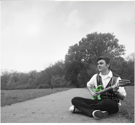
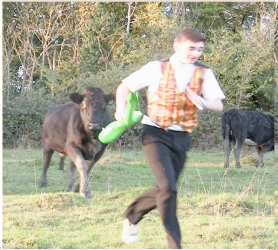
This is the second draft of my music video. Since the first draft, I made various changes before exporting my second draft. However, before I export my final draft, I need to play around with the colour correction, so the footage all looks the same, and also has a warmer feel.
Sunday, 22 December 2013
Music video first draft
This is the first draft of my music video that I exported. Once I played it outside of Final Cut, I looked to see what needed to be improved. This included re-framing and scaling some of the shots, cutting more sharply to the beat in various places, and also adding in more quick shots and taking out the longer ones. Moreover, I re filmed sections of my base track to include in the next draft.
Monday, 16 December 2013
An interesting video
Considering this blog is all about music videos, I thought I would share one of my favourite videos at the moment. It is important to note that I hate the song, however, I love the video. It is a great example of how important a music video is in terms of selling an artist because if the video was any different, I would not watch it altogether, as I only watch it because of the idea, not the song itself. After researching music videos in depth and working on my own, it is great to see that such a simple idea is so effective. Even though when watching it, the audience is caught up in the concept of the video, it should not go unnoticed the amount of different shots that have been used; 360 degree shot, close ups, bird's eye view, mid shots and profile shots to name but a few.
Digipak and magazine advert feedback
As part of my task for making the digipak and magazine advert, it was crucial to get feedback from people so I could build on what I had already created. Thus, I put a picture of them up on my twitter page and waited for people to write their comments.
This shows the tweet I made with the images attached.
These two screnshots show the feedback I was given, both good and bad, the good enabled me to see what I had done well, whilst the bad was constructive criticism that I could then go back and work on, so my work was the best it could be.
Editing on Final Cut
Whilst using Final Cut to edit my music video, I have learnt a range of new skills from cutting to the beat, colour correcting, making jump cuts and using new effects to name but a few.
This screenshot shows me incorporating an effect onto a piece of footage. The effects ease the transitions between the pieces of footage and deter an abrupt jump from happening.
As seen in other posts, I used the RGB effect to alter the colour of a scene. In the build up shots before this scene appears, each shot resembles one of the colours used, before the final shot with al three colours appears. This random burst of colour is exactly that, random. Although the green links with the colour theme of the digipak, they are the only scenes that have been edited in this way. This links in with the 'gag' aspect of the video as effects, colours and transitions fulfil this type of genre.
This shot shows me working to get this footage in time with the music, essentially, each foot tap would be in sync with the music for the duration of that shot. As you can see, I put the waveform on the audio track to make it easier to visually see the timing of the song, which allowed me to cut to the beat easily.
Moreover, this screenshot shows me cutting each quick shot to the beat. There was a series of shots taken for the 'da lat da' section of the song and each line had a different character. As a result, it was crucial to get each clip in time with the song as they were very quick transitions.
This is showing the process of making jump cuts on the Final Cut timeline. All you do is make a freeze frame of the section of the clip you want, drag it onto the timeline, and then take the other freeze frames from the rest of the video, in sequence. The end product is the freeze frames on the timeline that when played, jump from image to image in an effective way.
This screenshot shows me turning a series of clips into one big effect. Again, this relates back to the gag video, where from my research I saw that over the top, random editing, was a convention of this genre. Each clip comes on in sequence and then the fifth clip comes from the middle and takes over the screen, before the shot changes.
Finally, this screenshot shows me matching two of the trickiest masking shots to the music. Individually, they are about 2-3 seconds each, but took over 5 hours to make, each! However, they look very effective in the sequence and this is one of the effects that I enjoyed the most, as I never realised it was a possibility for my music video.
Thursday, 5 December 2013
RGB effect
In addition to masking, other types of editing are present in the music video. This mixture of edits, colour and effects fit appropriately with the theme of the 'gag video' and in a sense, add to the humour and the stupidity. This scene was done by playing with the RGB to make each character a different colour to make the split screen stand out.
Initially, the background was green to fit in with the colour scheme. However I didn't like the outcome and thats when I was introduced to the RGB colours, and that they could be emphasised individually around each character. The black background was then put in to bring together the shot. Lastly, they were made different sizes simply for effect and again, the green one was bigger to emphasise the colour scheme.
Masking
Of all the shots that had to be masked, I found 39 one the hardest because Nikita had to snatch a rose from herself which was tricky as contact was involved between the two masked characters. When filming this shot, I came into the scene and Nikita snatched the rose from my hand. This made it look realistic as she was actually snatching it from someone, instead of pretending to. When it came to editing this shot, I had to mask myself out and mask the slut character in.
This shows the masking around the slut character as I begun to work on the snatching of the rose. At first it was difficult because when the nerd character reached out to steal the rose, it was still visible in the second characters hand.
This shot shows the mask that was made around the nerd character to guide her movement in the actual snatching of the rose. What kept going wrong was the fact that it looked like the nerd character was going through the character of the slut when her hand went in for the rose, so in effect it distorted the footage altogether. What's more, a shadow was cast around the nerd character when she was in motion which emphasised the mask. As a result, two more masks had to be added to the layer.
In order to resolve the issue of the transitory hand and the fact that the rose was still there when the nerd had already snatched it, I had to import that section into Photoshop. Here, I used the Clone Stamp to take a sample of Nikita's skin colour on her neck, and use this to remove the rose, so in effect, it made it look like it had been snatched.
Scenes 59-61 consisted of the characters swapping the instruments. Firstly, the nerd had the tambourine and then in the next shot, the characters on either side of her had it. The next shot then showed the nerd back with the tambourine and the last shot, the other two characters had it again. Also, it proved challenging to get the characters to sing the line in time with each other and, once I had become familiar with the masking, it was this that became the most time consuming part of the editing.
This shot shows the nature character being masked into the shot, where in she and the slut would be playing the tambourine and the nerd would just be singing.
Finally, this shot shows all three characters masked into the shot, with the tambourines in the right place and the singing matched up. I discovered that switching on the waveforms helped a great deal when trying to align the singing as I could visually see when it was out, and which characters needed to be put in time with the others.
Monday, 2 December 2013
Digipak individual panels
Here are close up of the individual panels on my digipak.


This last picture is the first part of the three piece pull out and is the one that will be placed on the sixth panel, whilst the other two will come out as part of it.


This last picture is the first part of the three piece pull out and is the one that will be placed on the sixth panel, whilst the other two will come out as part of it.
My magazine advert
Here is my magazine advert, as you can see, I used the same image as the front cover of my album because when I was researching magazine adverts, they usually featured the same, or slightly different from the digipak cover. Moreover, after researching into magazine adverts by different artists, I became familiar with the conventions of them. These include ratings from magazines, release date, quote, and the artist's name and album title. Similarly, I kept to the colour theme of my digipak for consistency.
Subscribe to:
Comments (Atom)


